More Measurements To Deflate AGW Enthusiasts
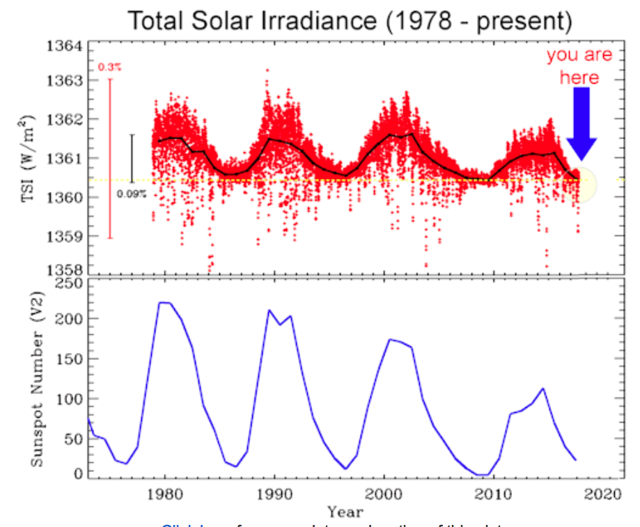
Total solar irradiance from 1978 to the present.
Space weather.com / Solar Dynamics Observatory
While obtaining the daily solar activity statistics for my Solar Activity page this morning, I came across the intriguing plot above on the Spaceweather.com website. Why is it so intriguing? Its fascination derives from the additional damage it does to the theory of Anthropogenic (i.e. man-made) Global Warming, or AGW.
Explanation of the Data
Before I discuss the implications of the plot, allow me to set the stage by explaining the data. Spaceweather.com is the website of a high school student group called Earth to Sky Calculus. Starting in 2011 it has periodically launched weather balloons with instruments to measure cosmic ray intensity in the stratosphere. The connection of cosmic rays to the AGW controversy is related in my post Solar Wind, Cosmic Rays and Clouds: The Determinants of Global Warming. [Actually, cosmic rays only help explain global warming on short time scales of around 35 years. I will fit it into a bigger picture in the next section.] In addition to publishing the results of the student group’s measurements, Spaceweather.com also publishes data from NASA and other sources concerning solar activity and solar wind in the vicinity of Earth.
One of those additional sources at sdoisgo.blogspot.com bills itself as “the Solar Dynamics Observatory Mission blog”, and appears to be a private blog discussing measurements from the Solar Dynamics Observatory (SDO) satellite, The government’s NASA SDO website can be found here. Although the solar irradiance plot above was obtained from the SDO blog website, the data apparently came from a number of other spacecraft, including the Solar and Heliospheric Observatory (SOHO) and the Solar Radiation and Climate Experiment (SORCE). Using data from these other spacecraft, the Physikalisch-Meteorologisches Observatorium Davos (PMOD) in Switzerland was the organization that actually produced the plot.
The fundamental data are the red spots in the top plot above, which represent the daily average Total Solar Irradiance (TSI) for each day from 1978 to the present. The TSI is the average power density of electromagnetic radiation from the sun in watts per meter-squared that reaches the spacecraft. If you ignore everything but the red spots in the plot, you can readily perceive a cyclic variation in TSI with a period of roughly 11 years. This cyclic variation is emphasized by the top plot’s black curve, which is the annual average of TSI versus year. One immediately thinks of a correlation with the eleven year sunspot cycle, a speculation confirmed by the annual average number of sunspots plotted versus time in the bottom graph. What this demonstrates is the correlation of sunspot number with total solar power output.
Implications for AGW
But there is more to be learned from these graphs. One particularly notable feature is that the dips, but particularly the peaks, of both TSI and sunspot number have been declining since the 1990s. This is in striking agreement with a model of 35-40 year bouts of global warming followed by similar spans of cooling in synch with similar periods of solar power increases and decreases. Consider the time plot below of the NCDC dataset of globally averaged mean temperature anomalies. A temperature anomaly is the difference between the actual temperature and some arbitrary temperature deemed typical for the planet. (Take your pick!) It was constructed by the National Climatic Data Center (NCDC) — now called the National Centers For Environmental Information — of the National Oceanic and Atmospheric Administration (NOAA).

Image Credit: National Climatic Data Center
Note that from roughly 1915 to 1941 global temperatures increased, followed by a period of global cooling from 1941 to 1975 that is so slight it looks more like a pause in the warming. Then from 1975 to the late 1990s we again had perceptible global warming. In turn this is followed by the pause in global warming we have experienced since the late 1990s. If past is prologue, we should expect this pause to continue until the late 2020s. Yet this pattern of warming followed by pauses in the warming has happened while atmospheric carbon dioxide concentrations have constantly increased almost linearly with time.

Skeptical Science / IEA / Mauna Loa record
If AGW is correct and human-emitted CO2 concentrations are such a dominant determinant of global warming, how can one explain these pauses in global warming? This is where the explanation grows slightly more complicated.
The eleven year sun spot cycle with solar power output waxing and waning appears to be superimposed on another roughly 70 year cycle, with about 35 years of increasing power followed by 35 years of power decrease. This is what the decline of the TSI and sunspot peaks since the 1990s seems to confirm. With a fall in solar power output comes a decrease in intensity in the solar wind. Now, it is well known that the solar wind can blow cosmic rays away from the interior of the solar system. Cosmic rays are primarily high energy protons and atomic nuclei that originate from outside our solar system, probably created by supernovae. As the intensity of solar power and the solar wind decreases, the intensity of cosmic rays allowed to penetrate Earth’s atmosphere increases. Cosmic ray particles are much more energetic than solar wind particles, and each one can ionize multiple particulates in the atmosphere. Each of these ionized particulates can then electrostatically attract water droplets to create clouds.

Image Credit: Universe Today / Simon Swordy, U. of Chicago
Thus, as the power output of the sun and the sun’s solar wind wane and cosmic ray intensity in the atmosphere increases, cloud cover of the planet increases. Clouds have a predominantly cooling effect, causing decreases in globally averaged temperatures. In the 35-40 year parts of the cycle when solar output increases, the mechanism reverses. Increasing solar wind blows more cosmic ray particles away from Earth, decreasing the formation of clouds and warming the planet.
This picture has been further verified by the aforementioned weather-balloon launching, cosmic-ray-measuring high school student group, Earth to Sky Calculus. Over the past decade or so with diminishing solar output, we would expect the diminished solar wind to cause growing cosmic ray intensity in the atmosphere. The students’ measurements do not disappoint, as shown in one of their latest plots shown below.

Spaceweather.com
The original idea for this mechanism is the brain-child of the Danish physicist Henrik Svensmark, and its development is the subject of the documentary embedded below. Even more videos of interviews, scholarly talks, and congressional testimony of eminent scientists opposing AGW can be found in my post What Consensus on Anthropogenic Global Warming?. A list of many of these scientists together with links to their curriculum vitae can be found in the post The Great Global Warming Scam, and a list of their refereed, scholarly papers can be found in Anti-AGW Global Warming Scholarly References.
“Wait!”, you protest. “If I look at the so-called ‘cooling’ periods in the NCDC plot of globally averaged temperature anomalies, they look more like pauses in an overall temperature increase. Are we not experiencing an overall warming from CO2 that is only modified by the sun, solar wind, cosmic ray, cloud mechanism?” Well, actually, no; and here is where the picture gets even more complicated. These 35-40 year half cycles are in turn on top of a much, much longer cycle of warming and cooling. These periods, called the Dansgaard-Oeschger cycles, are quasi-periodic and have periods of around 1000 years and half periods of warming and cooling of about 500 years. The previous warming phase was the Medieval Warm Period, which lasted from around 900 to 1300 AD. The following cooling phase is called the Little Ice Age, lasting from c. 1300 to 1850 AD. We are now in the warming phase of that cycle, which should last until sometime between 2300 and 2400 AD. Typical temperature changes throughout a half cycle appear to be 5 °C to 8 °C.
The causes of the Dansgaard-Oeschger cycles are controversial and unclear, and explanations range from an additional cycle within the Sun to events tied to the Earth itself. However, no matter what the causes, one thing we do know is that it has nothing to do with human carbon dioxide emissions. These cycles originated tens of thousands of years ago, long predating the industrial revolution.
Views: 4,074


