Objections to Anti-AGW Argument Answered
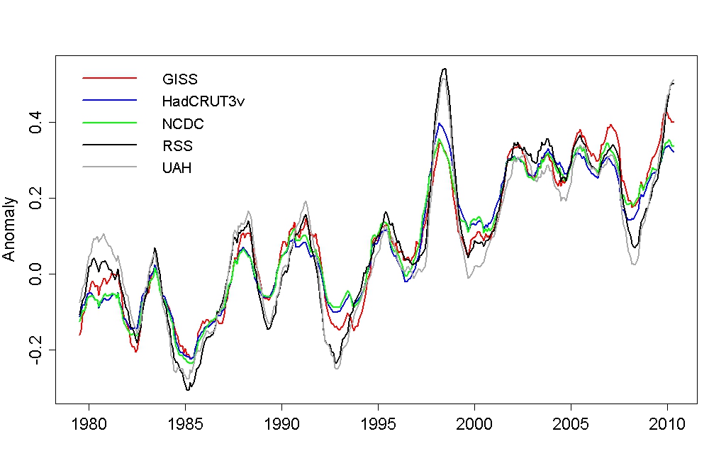
Comparison of smoothed globally averaged temperature data sets with common zero Image Credit: tamino.wordpress.com
Very recently, a friend and an opponent on a number of issues asked me to look at the post Comparing Temperature Data Sets and respond with my reactions. In this post the author wanted to demonstrate that all five of the major globally averaged data sets said essentially the same thing and they all show anthropogenic global warming (AGW).
You can see the final result of the post’s author in the theme image above. What is graphed for each data set is a temperature “anomaly”, i.e. the difference between the data set temperature, globally averaged over the surface of the Earth, and some standard, constant temperature. Since each data set had slightly different zeros, the author corrected each data set so that they had the same zero. He then filtered out noise by performing a twelve month moving average, and plotted the results above. The “signal to noise” ratio is absolutely terrible for all these data sets due to the small amplitude of the anomaly, the signal, and their large, rapid fluctuations.
The five major data sets include two which are generated from satellite measurements and three generated from ground station measurements. The two satellite generated data sets are those maintained by the University of Alabama, Huntsville (UAH), and the Remote Sensing Systems (RSS) group. The three ground generated data sets are those of the National Climatic Data Center (NCDC) of the National Oceanic and Atmospheric Administration (NOAA), NASA’s Goddard Institute for Space Studies (GISS), and of the Climatic Research Unit of the University of East Anglia (HadCRUT). The ways in which each data set was constructed from measured data are reviewed in Global Warming Data.
My reactions to reading the Comparing Temperature Data Sets post, which can also be read as a comment reply in Global Warming Data, are shown below.
I have to admit I have been worried about whether the data sets had a common zero, and it is gratifying to see their similarities once a common zero is picked and a filter for the noise applied. It would have been better had the author applied a cubic spline or piecewise quadratic fit, rather than a 12-month moving average, as the moving average weights past data too much.
However, significant differences between the satellite data sets (UAH and RSS) and the ground station data sets (GISS, NCDC, and HadCRUT3v) remain. Just “eye-balling” the data suggests to me the satellite derived anomalies are at most dates about 0.1 deg Celsius below the ground station derived anomalies. Given the smallness of the “signal”, that is a pretty large difference.
Also, I must disagree with the author that they all show overall warming. Imagine you are fitting a straight line to the data between 1980 and 2000. All data sets on that time interval would indeed yield lines with positive slopes indicating warming, with the satellite lines having a smaller slope. Imagine now you repeat the exercise for the data between 2000 and 2010. Doing this by eyeball is very imprecise, but you should remember a fitted line would have roughly as many data points below it as above it. When I do that, my eyeball tells me much more horizontal lines result, telling us of the much celebrated (or scoffed at) global warming pause from roughly 2000 to 2010.
Now, I expect people on the anti-AGW side of the argument would say something like the following. Global temperatures reached a minimum around 1860 with the end of the cooling phase of the long 1500 year cycle, i.e. the end of the little ice age. We should now expect on average generally increasing temperatures with the warming phase of this long cycle, with perhaps some shorter periods of time when this warming is interrupted by other phenomena. We appear presently to be in the middle of such an interruption, due to the fact that solar power output is decreasing.
It is not so much because the incident power on Earth is decreasing that warming is taking a hiatus. It is because the solar wind is decreasing in intensity and not sweeping the charged particle components of cosmic radiation away from the Earth’s atmosphere. These very high energy charged particles can then penetrate deep into the troposphere, ionizing suspended particulates to form nucleation centers for water droplets to aid in the formation of clouds. Clouds have a net cooling effect by reflecting solar radiation back into space before much can be absorbed by the atmosphere. See the posts Clouds and Global Warming and Solar Power Output and Global Warming for more on the formation and verification of this physical picture.
The physical picture painted in the last paragraph can explain at least part of the warming between 1970 and 2000 and its hiatus since then, as the solar output was increasing in the warming period and has been decreasing during the hiatus. This is why I keep a Solar Activity page under the Statistics main menu item. On that page I am keeping track of the sun spot number and the intensity of the solar wind in order to follow solar output. If these measures of solar power output continue to decline, I would expect the warming hiatus to continue or perhaps even some cooling to appear. Once solar output increases again, I expect global warming to resume.
Finally, I would like to relate some distaste with the way the author of the Open Mind post begins his article by calling Anthony Watts an idiot. We are living during a period of great social and economic turmoil in which this argument about AGW has extremely large consequences. It is not possible to solve our problems and avoid civil war if we have no dialogue between the contending sides. Calling each other names is not conducive for continuing dialogue.
The previous paragraph was the last in my comment reply, but I have found another interesting answer to those who would rebut the anti-AGW argument. Let us suppose, despite everything I have written so far, that the dominant driver of global warming, when it occurs, is the greenhouse gas CO2. But is it mankind that is the primary source of increasing CO2? In the post Most Of The Rise In CO2 Likely Comes From Natural Sources, it is shown that increasing CO2 concentrations have a much greater correlation with sea temperatures than with the HadCRUT4 air temperatures. This is indicated by what is called the coefficient of determination, r2, which for a linear least squares fit is related to the root-mean-square (RMS) deviation of the temperatures to the linear fit. When r2=1, the linear regression perfectly fits the data and when it is zero the line does not fit the data at all. The r2 for the the correlation of CO2 concentrations with HadCRUT4 air temperatures is 0.05386, while the r2 for the the correlation of CO2 concentrations with sea temperatures, the HadSST2 series, is 0.5528, ten times as large as the correlation with air temperatures.
How can this be? The only plausible explanation is that it is sea temperatures driving most of the increase in observed CO2 concentrations, not CO2 concentrations driving an increase in air temperatures. The solubility of CO2 in sea water decreases as sea temperatures increase. When the sea warms, CO2 is driven from solution into the atmosphere. We can interpret this only to mean that the predominate increase in CO2 is from the seas warming, not from human emissions.
Views: 2,357


