U.S. Economy and Stock Markets, November 2017
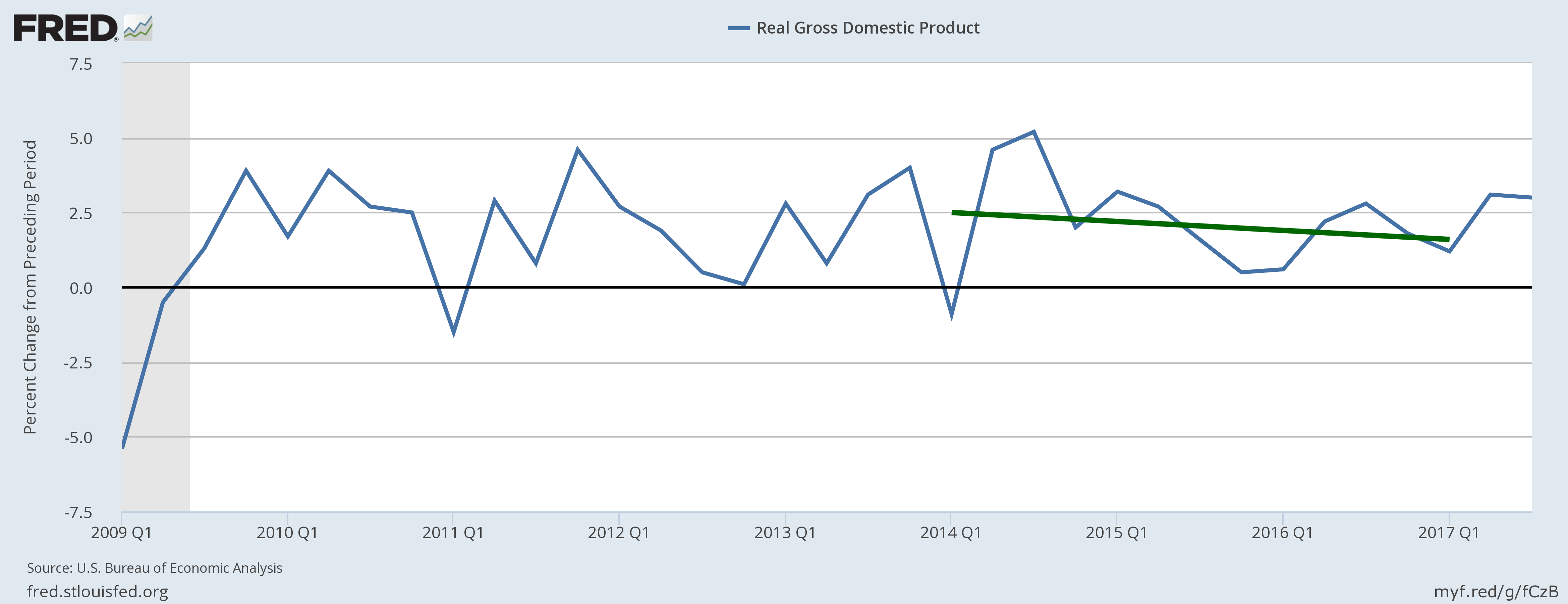
US real GDP growth from Q1 2009 to Q3 2017. The green line is a linear fit to the GDP over the three years from Q1 2014 to Q1 2017.
St. Louis Federal Reserve District Bank / FRED
I have have just updated the leading and coincident economic indicators I am following, the first update I have done since last May. That means it is time to take a more analytic view of just what is happening to our economy, and why.
What the Economic Statistics Tell Us, and Some Telling Conflicts Among Them
The bottom line of the economy is the value of the GDP and its growth rate. If you compare the plot of GDP growth in the featured image above with the corresponding plot from last May, you will see the significant improvement in the economy’s performance since then. For the first time in three years, the economy has been able to rack up two consecutive quarters of three percent growth or better. In the process it has also broken the three year long linear downtrend in economic growth we have experienced. The GDP growth for the first quarter of 2017 was the typical anemic Obama-era rate of 1.2%, while for the second and third quarters it was 3.1% and 3.0% respectively.
This improvement is reflected in the rest of the economic indicators I am following; but before I continue discussing what they show, I should say a few words about them. First, there are two different kinds: Leading indicators that change before the economy changes from growth to recession and vice versa; and coincident indicators that change in phase with growth or recession. The coincident indicators are useful primarily for confirming the change anticipated by the leading indicators. Each indicator has three possible states: Bearish if the indicator points to recession; Bullish if it indicates growth; or Neutral if it shows neither. I assign a score of -1 to a bearish indicator, zero to a neutral one, and +1 for a bullish indicator. Summing them up for each indicator group then gives the total score for the leading and coincident indicators separately.
Last May, I had twelve leading indicators with three bearish, five neutral, and four bullish for a total score of +1 bullish. Of the six coincident indicators, one was bearish, two were neutral, and three were bullish for an overall coincident score of +2 bullish. This month among the leading indicators, three are bearish, two are neutral, and seven bullish for a total score of +4 bullish. Unfortunately, I have lost one of my coincident indicators (the change in the Labor Market Condition Index or LMCI) because the Federal Reserve has decided to discontinue it. So among my five remaining coincident indicators, all five are bullish with a total score of +5. You can not get much more positive than that!
We should take a look at some of the more important indicators to see what they can tell us about what is happening to the economy. For example, consider the velocity of M2 money. The M1 money stock is the sum of all physical money (coin and paper currency), checking accounts, demand deposits, and negotiable order of withdrawal accounts. The M2 money supply is all of M1 plus what is considered to be “near money”: savings deposits, money market securities, mutual funds, and other time deposits. “Near money” are assets than can be quickly converted into M1 and rapidly used in transactions. Flows of M2 are then a measure of how many goods and services are being demanded. Of course, if the economy is suffering high inflation, an increase in such flows might indicate price increases more than an increase in demand for goods and services. However, in a low inflation environment like now (according to the Federal Reserve CPI inflation is currently +2.2 percent), the speed with which M2 changes hands is a highly accurate indication of the rate at which goods and services are being sold. The velocity of M2 money is defined to be the average number of times an M2 dollar is exchanged each year. With that background in mind, consider the plot below.

St. Louis Federal Reserve / FRED
From this plot you can see that for most of the past three years, the velocity of M2 money pretty steadily decreased. Yet, at the same time the M2 money stock increased, as shown in the plot below. What this indicates is that as soon as

St. Louis Federal Reserve District Bank / FRED
money was created by the Fed, much if not most of it was piling up in bank accounts rather than being used for economic transactions. However, in the past two quarters this negative trend of the velocity of money has been broken, indicating increasing amounts of goods and services being demanded and sold.
This picture is confirmed by two other leading indicators: New orders for capital goods (excluding aircraft) and new orders for durable goods, as shown in the plots below.

St. Louis Federal Reserve District Bank / FRED

St. Louis Federal Reserve District Bank / FRED
As an economy heats up and more goods and services are demanded, companies look to increase the capital goods they possess to produce more of their goods. If they sell more goods, they increase their share of the newly produced wealth. At the same time, families and individuals with new jobs and income at their disposal look to acquire durable goods such as cars, appliances, and computer equipment. This point is underlined by the index of copper and copper products prices. Because of its importance to electrical wiring and manufacturing. the price of copper will increase as economic activity increases.

St. Louis Federal Reserve District Bank / FRED
The percent change in producer copper prices increased sharply after September 2016. It picked up speed with the November election of Donald Trump, but then plateaued between March and June of 2017. After then, it skyrocketed. Prices of copper and copper products are now increasing at the incredible rate of +27.50%!
Further evidence of increasing economic activity is provided by retail sales, which increased 4.69% year-over-year in September.

St. Louis Federal Reserve District Bank / FRED
So if companies are ramping up production of nondefense capital goods and durable goods, the number of employees on non-agricultural payrolls and their income should be increasing. The first speculation is confirmed by the following plot.

St. Louis Federal Reserve District Bank / FRED
This data provides the first little bit of disharmony. Yes indeed, non-farm employees are indeed increasing, but they are increasing at increasingly slower rates. In October of this year they increased only at a rate of 1.25% year-over-year. Meanwhile, personal income less current transfer payments from the government is again increasing.

St. Louis Federal Reserve District Bank / FRED
Note how personal income less transfer payments decreased almost continuously over the last two years of the Obama administration, and changed to growth only with the Trump administration.
Just about everything shown above demonstrates the Trump administration has started to light a fire under the American economy, which had been languishing under Obama. Yet, not everything is happiness and light with the current crop of indicators. In particular, the Federal Reserve’s Leading Indicator for the United States is a real downer.

St. Louis Federal Reserve / FRED
Although this index had been falling over more than the last two years of the Obama administration, it has absolutely plummeted since around April of this year under Trump. What is the explanation for this, given all the positive developments we have seen? Right now, I haven’t the foggiest idea, but I am certainly going to try to find out.
In addition, there are a number of other indicators like the total number of nonfarm employees above, which while increasing in a desirable way, are doing so at increasingly smaller rates, or are slowly decreasing at accelerating negative rates. These indicators include the St. Louis Federal Reserve Bank’s Coincident Economic Activity Index for the U.S., and new building permits. There are enough bad things continuing to affect the economy to keep all of us looking over our shoulders.
How Can Government Policies Change to Better the Economic Well-Being of Americans?
All of the improvement in the American economy so far this year can be attributed to one of two factors: (1) The Trump administration’s reduction of the regulatory burden on private business through presidential executive orders, and (2) a psychological optimism of business men and women that the Republican Party will reduce and reform federal taxes, and repeal and replace Obamacare. The problem with the first factor is that, just as Trump was able to reverse many of President Obama’s ill-considered executive orders with his own, so a future progressive president could cancel Trump’s orders by his own executive orders. As for the second factor, business optimism will last only so long as businesses are convinced there will be tax and/or healthcare reform. If that conviction vanishes, so will the optimism and the motivation to make large investments to expand the economy.
The major reasons for the economic secular stagnation of the Obama era were the government requirements — both in regulations and taxes — that made the making of business profits, both for small businesses and large corporations, extremely difficult if not impossible. To ensure any regulatory solutions are permanent would require enshrining them in law passed by Congress. Any changes whatsoever to taxes can only be made by legislative action.
Both regulatory reform and tax reform are vast subjects. Some thoughts I have had about the effects of government economic regulations and their reform can be found in the following posts:
- The Burden of Economic Regulations
- The Debilitating Effects of Obamacare
- Economic Effects of the Dodd-Frank Act
- The EPA, CO2, Mercury Emissions, and “Green” Energy
- Lessons of the “Great Recession” Not Learned
- The Dodd-Frank Act: A Giant Stride Along the Road to Serfdom
I have written about taxes and their reform in the following posts:
- Beware BEPS!
- Economic Effects of Current Tax Policy
- The Ideal Tax Regime – 1
- The Ideal Tax Regime – 2
- The Rahn Curve, Hauser’s Law, the Laffer Curve and Flat Taxes
- Big Corporations Abandoning the U.S. at an Increasing Rate
- Do the Rich Pay Their Fair-Share of Taxes?
- Do U.S. Companies Need Tax Cuts?
Absolutely any Congressional action to relieve the burdens of either economic regulations or taxes would help assuage corporate anxieties and inspire further investments in the United States. However, almost certainly the most important encouragement to keep businesses from fleeing to foreign countries and to persuade businesses to invest domestically would be corporate tax reform.The United States has the very highest corporate tax rates among all the economically developed countries. When you add the average state corporate tax rate to the 35 percent federal tax rate, you get a U.S. corporate tax rate of 39 percent.
Progressives often claim that because of tax breaks, most companies do not pay anywhere close to this high rate. It is actually very easy (albeit a bit arduous) to rebut this progressive claim. What I did was to obtain a list of the Standard and Poors 500 companies, and then obtained their financial information for 2016 from Morningstar.com. Using their income before taxes and the taxes they paid, I was able to calculate the effective tax rate for each company that included any tax breaks they had. Among the S&P 500 a total of 46 companies — or 9.2 percent — reported losses for 2016. These I ignored since no tax rate could be defined for them. Some few had tax credits greater than their tax obligations, meaning the government paid them, resulting in a negative effective tax rate.
After calculating the effective tax for all 454 companies having profits, I next constructed a scatter plot of each company’s effective tax rate versus their earnings before taxes. The result is displayed below.

Data Source: Morningstar.com
Note that because of tax breaks, most companies have effective tax rates less than the U.S. nominal corporate tax rate, but greater than either the European or world average tax rates. Of these companies, 26 had effective tax rates above the U.S. nominal rate (federal plus average state) of 39%; 287 had rates between the European average of 18.88% and the U.S. nominal rate; 102 had rates between 0% and the European average; and 39 companies had negative tax rates, i.e. the government paid them money because of tax breaks. The remaining 46 companies in the S&P 500 had losses rather than profits, and a meaningful effective tax rate could not be defined for them.
A little addition then shows that of the 454 companies for which tax rates could be defined, 313 or 68.9% had effective tax rates above the European average. Companies with effective rates below the European average were 141 or 31.1%. This is a very different picture from the one painted by progressives, with almost seven-tenths of U.S. companies being at a competitive disadvantage with European corporations just because of taxes. If we want to bring back jobs from overseas, stop the migration of our companies to foreign countries, sell more to international markets, and increase our economic growth rate, we must drastically reduce our corporate tax rates to at least the European average of 18.8%.
Besides the sheer size of corporate taxes, another disincentive to domestic corporate investment is the world-wide tax system of the U.S. What this means is if companies bring back profits earned overseas to the U.S., they must pay income tax on the repatriated funds as ordinary income to the U.S. government. They have already paid taxes on this income to the country where they earned it. Almost every other developed country in the world has what is called a territorial tax system in which they only tax corporate income earned in their own territories. This fact presents a huge disincentive to U.S. multi-national corporations from repatriating foreign profits. The disincentive has motivated such companies to hold financial assets overseas that were valued at $2.1 trillion in 2014. A more recent estimate was $2.6 trillion. If U.S. multinationals could be persuaded to bring a large fraction of those assets back into the U.S. and invest it, those investments could mean a huge increase in economic growth. Federal Reserve data shows third quarter annualized GDP to be $19.5 trillion, so the $2.6 trillion of overseas assets represents 13.3% of our entire GDP!
The current Republican tax bill in Congress reputedly addresses both these problems. It reduces the top corporate tax rate from 35% to 20% (remember, the average European corporate tax rate is 18.88%), and it converts the federal tax system to a territorial one. However, one great criticism of it is that it does not significantly cut taxes on the very rich, who do most of the investing. The fact they are very rich is more often than not due to the fact they have invested well in the past, and the top 20% of earners pay 95% of income taxes according to the Office of Management and Budget. The top 1% paid nearly half of all income taxes in 2014. Therefore, if you want to transfer more of the responsibility for allocating the nation’s investable resources away from government to those who have demonstrated the capability to do it effectively, this bill does not do the job.
The political Left has obfuscated this point quite a bit by claiming the bill would be a windfall for the very rich. This claim is predominantly false, but to rebut it convincingly is a complicated discussion. To make this point well would involve a discussion of tax breaks that would be removed as well as the countervailing eliminations of the alternative minimum tax and the death tax. I am planning to write a post on this in the near future, but for now I will limit myself to the following comment: The top two tax brackets with tax rates at 35% and 39.6% would capture more taxes at the 35% rate and less at the 39.6% rate.
Currently, for single filers the 35% rate would be levied on individuals with incomes between $416,700 and $418,400. This would be changed to levy 35% on individual filers with incomes between $200,000 and $500,000. For a married couple, the 35% rate is currently levied with a household income between $416,700 and $470,700, which would be changed to income between $260,000 and $1 million.
Single filers at the 39.6% currently have incomes at or above $418,400; with the proposed bill they would have incomes at or above $500,000. Married filers at the 39.6% bracket currently have incomes at or above $470,700. The proposal would begin the bracket for couples at an income of $1 million. Nevertheless, at this tax bracket much of the lost revenue from dropping some people from the 39.6% rate to the 35.0% rate would be recovered by the elimination or reduction of itemized deductions. For example, the proposal would retain the mortgage interest deduction, but tighter limits would be applied. New buyers of property would only be allowed to deduct interest on loans up to $500,000, instead of the current $1 million.
Even though the proposed tax bill would not release a large portion of the domestic income of rich families and individuals from taxes, it should still be a huge boost to the economic activity of companies, particularly multinationals. The entire point of the discursive discussion of taxes above was to point out what a shock it would be to them if the bill did not pass. If American companies begin to believe the rewards for investing and producing more would be greatly reduced, the United States would see a lot less investing and producing. Without a legislative win on taxes, the improvements we have seen in the economy so far this year could collapse.
The Reaction of the U.S. Stock Markets
The U.S. stock markets concur with the judgement of American companies on the Trump administration economic policies, as can be seen in the two stock charts below of the Dow Jones Industrials index and the Standard and Poors 500 index.

Image courtesy of StockCharts.com

Image Courtesy of StockCharts.com
However, the same caveat on the stock markets as for corporate investments should be kept in mind. If companies can not thrive and grow because tax reform fails, then the stock markets could also be expected to collapse.
Views: 2,605


